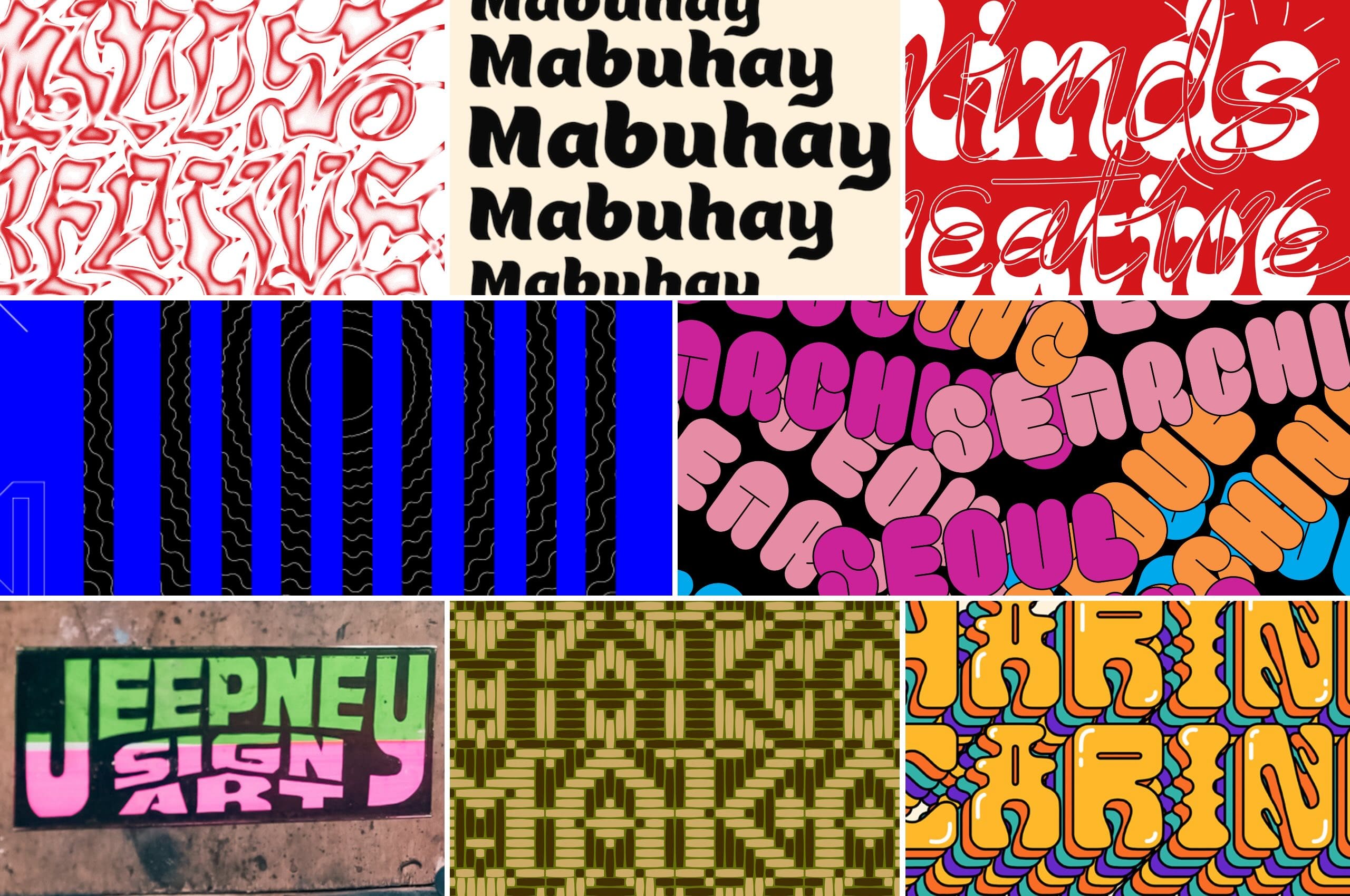
It’s difficult to pinpoint what exactly makes a font “Filipino.” Is it the sweeping brush strokes of the hand-painted signs in our jeepneys? The big bold letters that curve along the handle of a Baguio walis tambo? Or those pakupya accents that we should (but never) put over our vowels like small hats? Is it all of the thousands of visual cues we see every day, or something more? These are the questions that Filipino type designers grapple with when trying to capture the visual language of the Philippines.
“Filipinos have always been very typographic,” says Clara Cayosa, a graphic and type designer. “We’re always trying to sneak in a loved one’s name into a jeepney or a tricycle or a blanket. We try to personify everything. And how do we do that? Through letters, through forms.”
Cayosa has devoted much of her career to the connection between typography and Filipino culture. Having worked at Manila-based independent design studio And A Half, Cayosa also handles Tipong Pilipino — an incubator dedicated to developing new Filipino types. In an interview with Rolling Stone Philippines, she emphasizes the importance of crafting typefaces that authentically represent the Philippines, particularly for newcomers arriving in the country. “That was a question I started thinking about when I was going back and forth from the United States,” says Cayosa. “What is the first typeface people see when they arrive in the Philippines? And is the font representative of our country?”
“Look at NAIA [Ninoy Aquino International Airport],” continues Cayosa. “As soon as you land you see signs that say, ‘Mabuhay, ‘Welcome to the Philippines,’ even ‘Customs’ — do they look Filipino? I think [not.] You see Arial, Helvetica— five, six different fonts. I wish we were more attuned to our visual cues.”
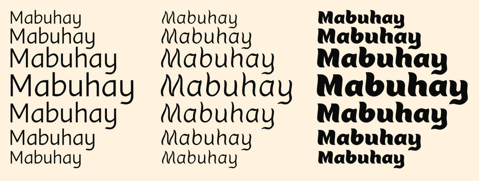
Cayosa’s Mabuhay typeface, created during her 2023 Type West scholarship, is the designer’s exploration of blending Filipino culture with global accessibility. “When I was making Mabuhay, I found that non-Filipino viewers didn’t think it looked legible,” says Cayosa. “I always [found] this interesting because I see jeepney signs all the time. It’s easy for me to read those very narrow and condensed forms. But let’s say an American or a foreign graphic design critic sees them, they’ll say, ‘I can’t read this. You’re not following the fundamentals of spacing.’ They have a totally different set of eyes. Whereas with Filipinos, when we [read] a jeepney sign, we’re like, ‘Yeah, that’s SM.’ It’s like we have a superpower.”
“When I showed [Mabuhay] to my peers in San Francisco, it was hard for them to read,” continues Cayosa. “And I thought, ‘Okay, I need to consider them too.’ I have to take their eye into consideration.”
No Singular Identity
This tension between personal expression and broader accessibility reflects a deeper conversation within the Filipino type design community. The challenge of creating a font that resonates both visually and culturally isn’t black and white. Designers still grapple with the complexities of defining what truly makes a typeface Filipino.
“That’s a difficult question to answer, and it’s something that comes up a lot in conversations with Filipino type designers,” says Jo Malinis, founder of type design platform Type63 and co-founder of typography event Type Fair PH.
“I think it depends on the person behind the crafting,” Malinis tells Rolling Stone Philippines. “It’s a Filipino typeface if a Filipino made it. It’s as easy as that. I don’t like putting Filipino type into a box.”
With years of experience as a graphic designer, type designer, and educator, Malinis has not only refined her craft but also mentored the next generation of Filipino type designers. As a co-founder of Type Fair PH, alongside Canva creative lead Kookie Santos and graphic designer Jeth Torres, she has played a pivotal role in hosting typography workshops and strengthening the Filipino design community.
On the topic of Filipino typefaces, Malinis points out that the country’s cultural diversity makes creating a truly representative typeface a challenging task. “I did this interview with [illustrator] Adrian Panadero about typeface. I like what he said about the Filipino visual identity being crafted, that there is no singular Filipino visual identity. If a person is trying to impose one that means that it’s intentionally being made to look Filipino. You know, we’re very regionalistic. We have so many different subcultures in our huge cultural family tree.”
“When you create something, you pull from your experiences, even if you’re not intentionally referencing anything,” says Malinis. “But in my experience, a lot of things don’t get preserved correctly. For example, if we try to create typefaces based on our endangered written scripts, that’s an act of preservation, which requires a specific subset of skills. To digitize Baybayin, [type designers] need to discuss things like how a stroke should be modulated, where the thin and thick parts should be, how things should be written, how it should be translated when you use the keyboard — the things that we’re trying to preserve are things that can easily be lost.”
Design Momentum
The future of Filipino typography seems to be growing brighter as designers begin transforming what was once seen as a niche, underappreciated field. “Design is an undervalued industry here in the Philippines,” says Iloilo-born designer Jad Maza. “It’s treated as a side thing, not a profession.”
Maza’s type design practice is centered around creating typefaces for both Latin and Baybayin scripts, exploring what type design can look like when rooted in a Filipino context. His font families draw from Maza’s personal experiences, with Balete being a notable example. The typeface is inspired by the roots of the eponymous tree, a recurring motif in Philippine folklore associated with the dwelling places of supernatural beings.
There have been efforts made not just by type designers but by the country’s government agencies to spearhead Filipino-focused typefaces and type design.
For example, in 2019, the Department of Tourism (DOT) highlighted the “more Pinoy” typeface, Barabara, as part of the revamped logo for its “More Fun” campaign. Meanwhile, designer Aaron Amar also contributed by creating Cubao Free — a font inspired by the distinct lettering of jeepney signages, preserving an essential part of Filipino street culture. The art zine Galing Probinsya introduced the Promdi font, crafted by designer Dapat Studio for the zine’s first issue Galing Visayas, which champions the works of creatives from the Visayas region.
“In my work, I want to highlight that we are a country rich in culture, heritage, diversity,” adds Maza. We could be at par with our international colleagues.”
With initiatives like Malinis’ Type Fair PH and Type63, as well as Cayosa’s Tipong Pilipino, the future of the Filipino design community seems to be bright as more designers begin embracing the challenge of creating work that reflects the country’s cultural landscape.
“I’m hoping that it keeps growing,” says Malinis. “I really want more people in this field…[Type design] isn’t supposed to be trendy. It’s supposed to be something that we continue doing.”