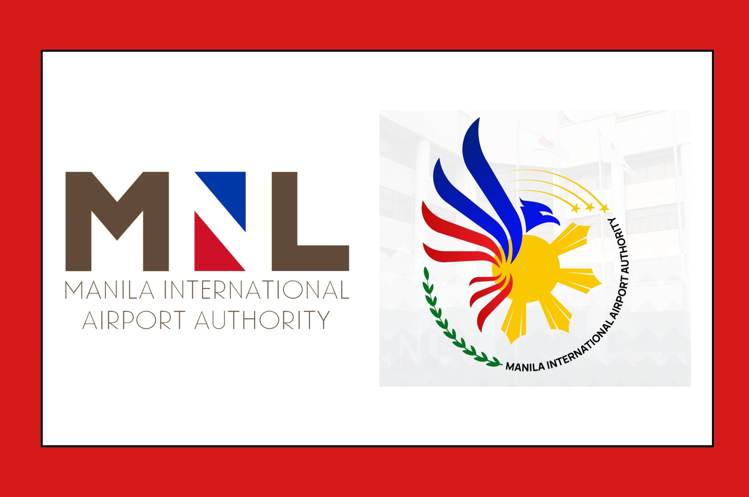
The Manila International Airport Authority (MIAA) has a new logo and its design choices are … interesting, at best.
On March 7, the government agency announced its new logo to both mark its 43rd anniversary and to celebrate its shift from operator to regulator of the Ninoy Aquino International Airport (NAIA). “The unveiling of our new identity is a significant step in our journey towards becoming a regulatory authority that prioritizes safety, efficiency, and innovation,” said MIAA General Manager Eric Jose Ines at the brand-launching ceremony.
However, Filipinos immediately commented on the less than aesthetic appeal of the new logo. “Was this absolutely necessary?” One X user wrote in regards to the logo change. “May mali po ba sa nakaraang logo?” Others were quick to point out how the eagle in the new MIAA logo was most likely taken from a stock vector image available on the website Vector Stock for $15. According to the MIAA’s 2025 Annual Procurement Plan, the agency reportedly set aside P3 million for its rebranding campaign as well as an additional P2 million for creative design services and social media content creation.
“It looks like if you put 20 ideas all into one logo,” said Ric Gindap, the Creative and Strategy Director of branding agency Design For Tomorrow. “My main beef with the logo is its lack of application scalability. You cannot engrave it in one color, and you can barely have it embroidered onto a uniform without making all its elements illegible. You can’t even make a decent Facebook profile photo out of this.”
Gindap, whose branding agency has been providing design-oriented solutions for thirteen years, went on to lament the new logo’s lack of national identity. “The MIAA logo is important because it needs to sum up the entire Philippine experience for people when they land in the airport,” said Gindap. “It needs to make a good first impression. Plus, an airport is a very busy environment: Logos must be understood right away, and no one has the time to look at a complex logo. But more importantly, a good airport logo inspires not just confidence, but also a sense of pride. When you look at the new logo, does it inspire your pride to be Filipino? Does it reflect our higher aspirations as Filipinos?”
On the logo’s alleged cost, Gindap noted that, while a total of P5 million is a mid-tier price for most branding agencies, he felt that the MIAA could have made a greater effort to create a more unique logo. “If you’re using public funds, you shouldn’t be downloading a stock vector online,” Gindap said. “The [MIAA] is billing taxpayers millions of pesos for work that people can plainly see is a little bit lazy — it’s understandable why everyone is upset about this.”
The Golden Age of Government Logos
The MIAA is the latest in a string of government agencies allocating funds to pay for aesthetically questionable brand revamps. In 2023, the Philippine Amusement and Gaming Corporation (PAGCOR) spent P3 million to launch its new logo, much to the chagrin of Filipino netizens and graphic designers. Similarly in 2023, the Department of Tourism (DOT) replaced its signature slogan — “It’s more fun in the Philippines” — with “Love the Philippines,” which was met with criticism from Filipino citizens and lawmakers alike. Senator Nancy Binay even filed a bill to create stricter logo change regulations to prevent arbitrary changes.
However, there was a time when Philippine government agencies prided themselves in their highly striking and memorable logo designs. “Our government agencies had a golden age of mid-century and modernist logos,” said Gindap. “We had some of the most amazing graphic identity systems for the government from the ‘50s to the ‘80s. I don’t know when it went downhill because nowadays, it looks like we allow complete sophomores to have a stab at creating identities for institutions that affect our lives on a daily basis.”
Old agency logos, such as the ones for PAGCOR, the Philippine Charity Sweepstakes Office (PCSO), and the Department of Science and Technology (DOST), among others, were once important mainstays in the country’s cultural landscape. “When you travel around any city in the country and you see a logo on top of a building, it becomes your landmark,” said Gindap. “That logo becomes your marker. It becomes embedded in your consciousness.”
“If your logo is misunderstood, that means your brand as a government agency is misunderstood,” added Gindap. “And a brand that is misunderstood is never powerful.”